I don’t remember if I became a fan of Mark Hurst because of his Good Experience Games or This is Broken or some other aspect of his good user experience work, but I am a big fan, as I’ve mentioned before.
Re: This is Broken, I ran into two egregious examples today:
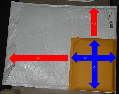
- this packaging disaster, courtesy of ASAP software, recently bought by Dell:
- the other item is the WiFi activation switch on the HP Pavilion laptop. first, let me just say that having a physical WiFi activation switch makes no sense to me, but that may just be my higher-than-average comfort with technology talking (I have no problem disabling network adapters via the user interface, for example). That said, putting the switch somewhere where it can be inadvertently toggled is bad design to begin with. This is the case not only with the pavilion, but with another friend’s Toshiba laptop that I dealt with some months ago. Anyway, the brokenness of the HP switch isn’t just in its location (the front panel of the laptop, where it can easily be accidentally flipped on/off). The bigger problem is its design, especially in terms of feedback. I haven’t been able to find a decent picture of it, but here’s a pic of a well-designed wifi switch:

The switch on the HP is also a side-to-side toggle, but the little antenna icon is on one side, and an LED is on the other. That said, which position do you think is “on”? I bet more than 90% of people presented with that question would say the side with the icon. And we would all be wrong. Yes, the OPPOSITE side, the side with no icon or any marking at all, is the position that turns the wifi adapter on. The LED? Oh, that lights up either way. And no, not in the universally recognized red & green for “stop/no signal” and “go/signal”. No. This one is, if memory serves, blue and orange. Unbelievable.